The Aichi-Nagoya 2026 Asian Games are not only about sporting excellence but also about celebrating unity and culture. Every element of the Games’ visual identity – from the emblem to the slogan and colour palette – has been carefully designed to reflect the spirit of Asia’s biggest multi-sport event.
The Meaning Behind the Aichi-Nagoya 2026 Emblem
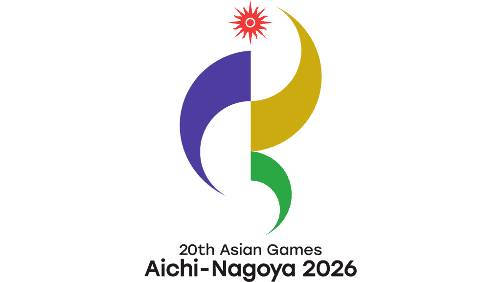
The official emblem captures the movement and energy of sport through flowing curves that converge towards a bright red sun, symbolising the Olympic Council of Asia.
Its design also subtly incorporates the letters A and N, representing Asia, Aichi and Nagoya, linking the Games with both the continent and the host region.
Each colour carries a distinct meaning:
- Purple represents the iris, the official flower of Aichi Prefecture.
- Gold is inspired by the famous Kinshachi ornaments atop Nagoya Castle.
- Green reflects the forests and natural heritage of the region.
The emblem was created by Hiroshi Miyashita, Associate Professor of Design at Aichi Sangyo University, with the aim of creating a lasting symbol that resonates beyond the Games.
“Imagine One Asia”
The official slogan, Imagine One Asia, highlights the unifying power of sport.
Athletes from diverse cultures and backgrounds compete on the same stage while sharing common experiences throughout the Games. The slogan reflects the organisers’ vision of an Asia connected through friendship, respect and competition.
It was created by Japanese copywriter Waka Sakamoto, who sought to express the idea of a united Asia beyond geographical and cultural differences.
Five Colours That Tell the Story
The Games’ Core Graphics use five signature colours that appear across venues, public spaces and official branding.
- Jonetsu Red – Represents athletes’ passion and echoes the red of Japan’s national flag.
- Kakitsubata Purple – Inspired by Aichi’s iconic iris flower.
- Shinrin Green – Symbolises the forests of Okumikawa and the region’s natural beauty.
- Kinshachi Gold – Reflects the golden ornaments of Nagoya Castle.
- Dento Ocher – Represents Aichi’s rich traditions, history and manufacturing heritage.
The Core Graphics were designed by renowned art director Akio Ogawa, whose previous projects include Chubu Centrair International Airport, COP10 and Aichi Sky Expo.
A Symbol of Unity
Together, the emblem, slogan and colour palette showcase the identity of Aichi-Nagoya while celebrating the diversity of Asia.
Blending regional history, culture and nature with the excitement of international sport, the visual identity delivers a clear message: sport has the power to unite Asia on one stage.